Crafting a cohesive yet highly flexible Brand identity & Packaging for I•Likey built to grow with endless flavours.
| Client: | I•Likey |
| Year: | 2025 |
| Industry: | FMCG |
| Duration: | 5 weeks |
Services:
| Naming | Brand Positioning | Brand Identity |
| Packaging Design | Art Direction |
Overview:
Founded by Radha, Sameer, and Nirmal in Bengaluru, I•Likey was born out of a shared love for ice creams and the joy of flavour explorations. After years of professional work and prior experience in the ice cream business, the trio set out to create something new, a brand that celebrates flavours, textures, experimentation, and sensory delight. The vision was to make I•Likey not just an ice-cream brand, but an experiential Icecream & dessert world through stores, pop-ups, and flavour experiments that invite curiosity and play.
Challenge:
The brief was simple, yet layered with ambition to create a brand world that could hold endless flavours possibilities within a single, cohesive identity.
As a bootstrapped venture, I-Likey needed a design system that was expressive yet efficient, something their in-house team could easily adapt as new experiments and flavours emerged each day.
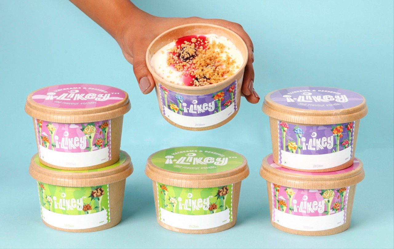
The challenge lay in designing an identity and packaging system flexible enough to expand across flavours, categories, and Packaging formats, while keeping production budget-friendly and scalable.
Brand Essence:
Each scoop is more than taste, it’s a small adventure, layered with texture, surprise, and delight. The brand was built to remind us that joy doesn’t come from what’s familiar, but from what’s waiting to be discovered.
Naming:
Inspired by Human expression A Happiness, Playful sounds and moments of the pure sensory pleasure. I•LIKEY represents the feeling ofa scoop of Joy.The idea of spontaneous joy and sensory delight guided the naming process. The aim was to create a name that felt light, playful, and instinctive. Something that would make people smile the moment they said it. Sound-wise cheerful and instantly memorable, the name captures the pure, unfiltered pleasure of tasting something you love.
Tagline:
Dive into a flavour forest
Every scoop takes you deeper into layersof indulgence, textures, and natural richness. The forest is not just literal (trees, leaves) but metaphorical, a world of endless discovery, surprise, and sensory delight
Color System:
A complementary colour framework anchors this modularity, categorising products into flavour families of chocolate, nuts, and dairy, while preserving the sense of endless flavours that defines the brand.
CRAFTING A JOYFULIDENTITY SYSTEM
At the heart of I•Likey lies a logo that captures the brand’s handcrafted charm and joyful spirit. The wordmark, set in Canvas Inline, was chosen for its textured, artisanal quality echoing the care and craft behind every scoop of handmade ice cream. The subtle imperfections of the type lend a tactile, human feel, reinforcing the brand’s small-batch authenticity.The logo’s composition embraces a sense of movement and spontaneity, reflecting the brand’s experimental nature and its world of endless flavours discovery.
Logo Type Logo Mark Logo Lockup
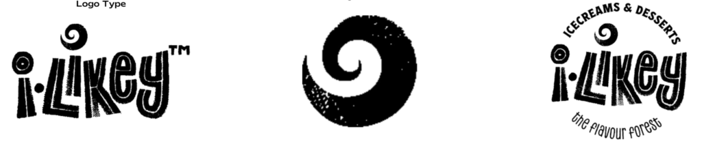
Illustration system:
To bring the idea of the Flavour Forest to life, we collaborated with an illustrator to develop a modular illustration system. One that could adapt to I•Likey’s ever-changing flavour experiments while staying consistent and recognisable.The challenge was to design visuals that were flavour-agnostic, yet expressive enough to represent the brand’s wide palette of fruits, nuts, chocolate, and dairy.
Fruits Category
Chocolate & Cheese Category
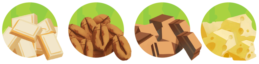
Nuts Category
2 Color Illustration
Typography
In I•Likey, typography becomes more than a communication tool it’s a reflection of craft, curiosity, and the brand’s layered flavour world.
CANVAS INLINE
The Canvas Inline typeface, also used in the main identity, forms the foundation of the visual system.

CANVAS INLINE REGULAR
The Canvas Inline Regular typeface extends the handcrafted character of the identity into everyday communication. Allowing I•LIKEY to maintain its expressive personality across multiple applications
.
ESPIRITU REGULAR
Espiritu adds expressive range and warmth to I-Likey’s visual language. A versatile type family with four distinct styles: script, expanded, condensed, and dingbats. It embodies the brand’s handcrafted and experimental soul. Each style brings its own rhythm and charm: the Expanded and Condensed variants lend structure and contrast for hierarchy in communication, while the Dingbats set offers playful, hand-drawn icons that complement the illustration system.

ESPIRITU SCRIPT
The Espiritu Script variant brings a spontaneous, handwritten energy to I-Likey’s world. Used primarily in stickers and to describe categories of products, it captures the playful, human side of the brand like a note scribbled with joy.

Benefit Icons
To extend I-Likey’s playful, handcrafted world into communication, a set of three icons was created each representing a key brand benefit and emotional cue.

Leave a Reply
You must be logged in to post a comment.