Darkins
Playing purely on the dark side
Client:
Darkins
Year:
2025
Industry:
FMCG
Duration:
5 weeks
Services:
Naming
Brand Positioning
Brand Identity
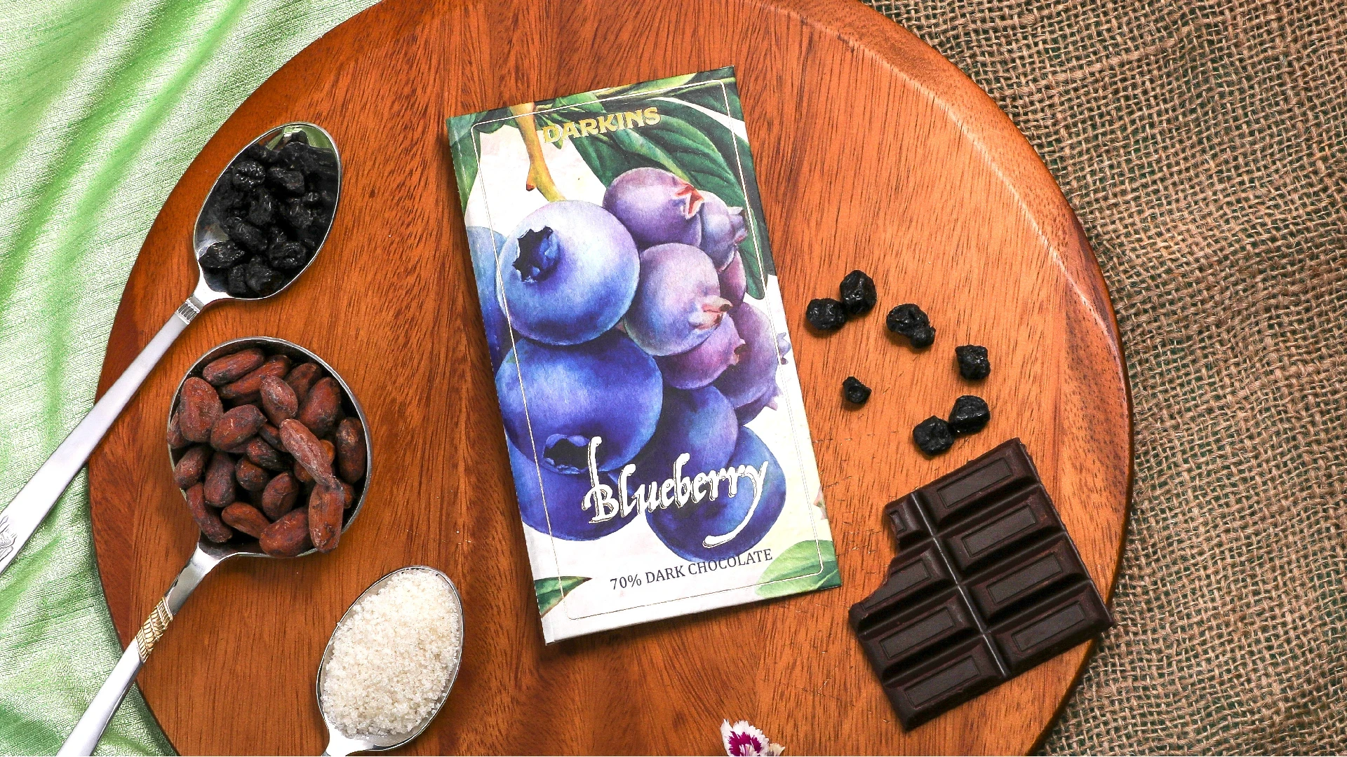
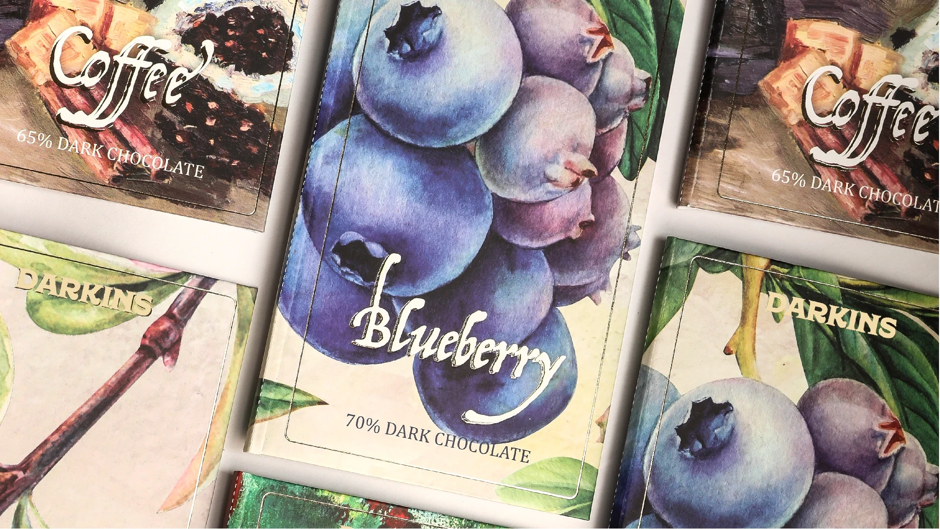
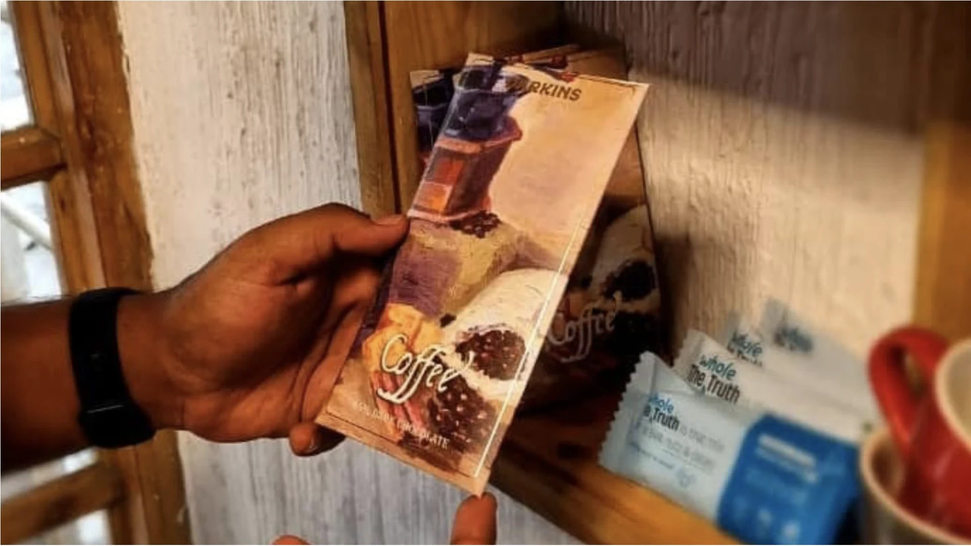
Packaging Design
Art Direction
Overview:
DARKINS an unfailing passion and commitment to perfection. From the rigorous selection of only the most premium ingredients from specially chosen regions of Kerala-land of coffee and spices, to identifying the freshest harvest, it is constantly looking for fresh inspiration that enhances the fine melting dark chocolate and push the boundaries of new flavour combinations.
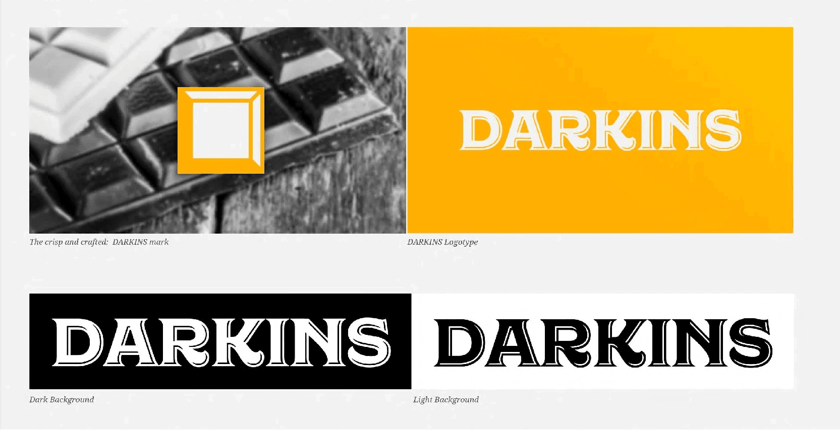
Identity
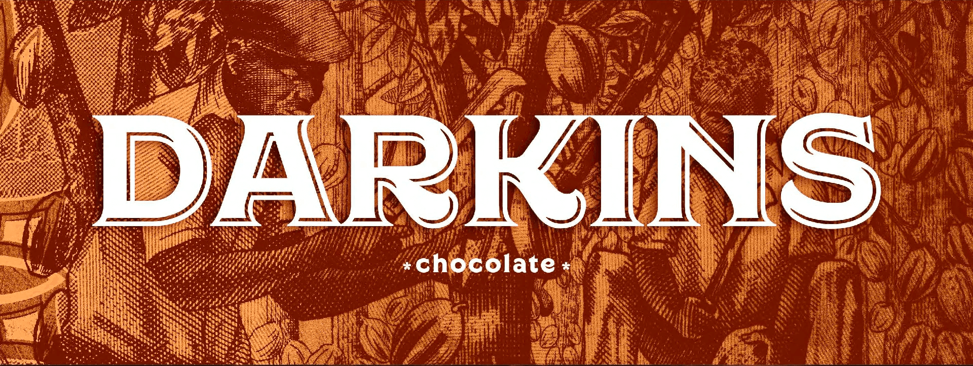
Handcrafted dark chocolates: The logotype is a direct representation of the brand. It is what the pronunciation of the name looks like, reads like. The typeaface had to be as crafted as the content.


Icons
Authenticity: Dark chocolate with flavours is the "WHAT" of the brand while uniqueness and perfection is the "WHY". Each elements on the packaging must justify the "WHY" of the brand. Icons are no exceptions.